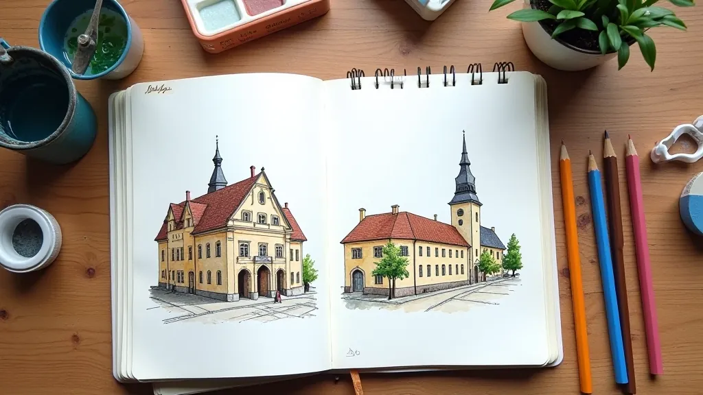
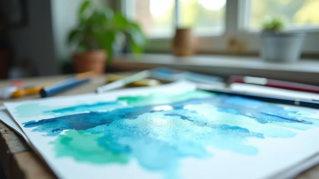
Essential Watercolor Techniques for Latvian Landscapes
Master wet-on-wet, glazing, and layering methods specifically for capturing the rich textures of Latvia's countryside and forests.
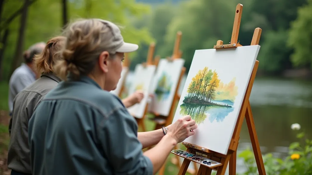
Read ArticleCapture the dynamic energy of Latvia's Baltic coast. We cover water reflections, atmospheric perspective, and handling moody Nordic light.

The Baltic isn't like other seascapes. It's restless. The light doesn't just hit the water — it bounces through clouds, reflects off sand, and shifts with the weather. We're not painting a postcard here. We're capturing movement.
After years of painting these shores, we've learned that success comes from understanding three core elements: how light actually behaves over water, why perspective matters more here than anywhere else, and when to hold back rather than overwork the painting. You'll get all three.
Light on water isn't a flat reflection. It's broken, dancing, constantly changing. The moment you add clouds or waves, you're dealing with multiple light sources bouncing off different surfaces. This is what makes the Baltic so challenging — and so rewarding.
Here's what actually happens: Direct sunlight hits the water and reflects toward you. But the sky also reflects off the water's surface, creating a different tone. Waves turn these reflections at different angles, creating movement and depth. When you're painting, you're not just showing where light lands — you're showing how it travels.
Start with a simple approach. Establish your light source first. Then ask yourself: where's the brightest spot? Usually it's a horizontal band across the water where direct light and sky reflection meet. Everything else — the darker waves, the shadows — gets their color from that relationship.
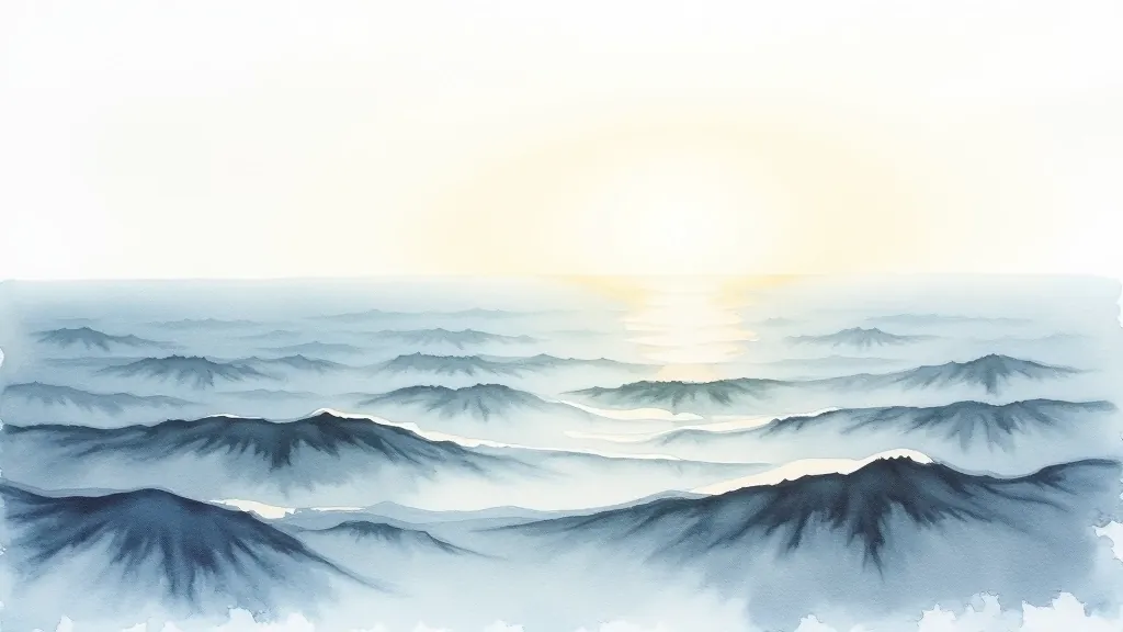
You already know that things get smaller as they recede. But with water, there's more happening. The color changes too. Distant water looks lighter, cooler, hazier. Foreground water is darker, warmer, more detailed. This isn't optional — it's how atmosphere works.
On the Baltic, the horizon often disappears into fog or mist. You might not see a clear line between water and sky. That's fine. What matters is the shift in tone and saturation. Your foreground waves should have actual texture — you'll see foam patterns, wave breaks, color variation. Your background dissolves. It becomes suggestion rather than statement.
A practical tip: paint your background water first, when your paper is wet. Let the colors merge and blur naturally. Don't force detail there. Then, once that's dry, add foreground waves with more control and contrast. The difference in approach creates depth automatically.
The techniques described in this article are based on established watercolor practices and personal experience painting Baltic seascapes. Every artist's approach varies based on their materials, experience level, and individual style. These methods are meant as guidance and educational framework. Your own experimentation and practice will ultimately shape your unique voice as a painter. We encourage you to test these approaches on practice paper before applying them to finished work.
Don't overthink this. You need three blues, two greens, and the ability to make grays. That's it. Most painters start with too many colors and end up with mud.
Ultramarine (warm, slightly purple), Cerulean (cool, slightly green), and Prussian Blue (dark, intense). These three mix everything you need.
Viridian for depth and cool tones. Yellow Ochre for warmth and natural mixing. Avoid straight premixed greens — they rarely look natural in seascapes.
Burnt Sienna or Alizarin for warm shadows. Light Red for sandy reflections. Mix these with your blues for realistic grays instead of adding black.

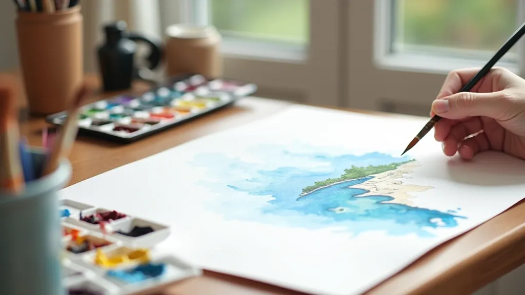
Don't wait for perfect conditions. You don't need to be standing on the shore. Start with reference photos and a simple approach.
Find a photo that shows clear light direction. You want shadows and highlights obvious. Moody, overcast conditions work better than bright sunny days when you're learning.
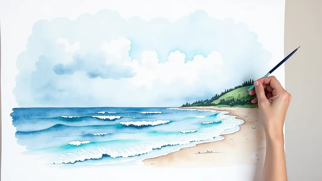
Draw horizon line and major wave shapes. Keep it loose. You're not aiming for accuracy — you're establishing composition. A light 2H pencil works best.
Use clean water and a large brush. This allows your sky and distant water to blend naturally. You'll have maybe 10 minutes before it gets too wet to control.
Your lightest values go down first. Sky, then distant water. Let each layer dry slightly before adding foreground detail. Patience here prevents muddy results.
Water is hard. Light is harder. Combine them and you've got one of the most demanding subjects in watercolor painting. But here's what makes it worthwhile: when it clicks, when you've captured that movement and light correctly, it's unforgettable. The painting feels alive.
The Baltic coast gives you everything you need to learn. The moody light teaches you about value. The restless water teaches you about movement. The horizon teaches you about perspective. Each painting builds on the last. You're not just making pictures — you're developing a real understanding of how light and water interact.
Start simple. Use your three blues. Trust the wet-on-wet technique. Don't overwork it. Get your reference, get your paper, and spend an afternoon painting. That's all you need. The Baltic's been inspiring artists for centuries. It'll inspire you too.